Armed Forces Memorial
With the advent of powerful desktop computers, combined with accessible font design software, type design has become, in many instances, a cottage industry. The strength of the Studio is the basis of drawing from which fonts are created; mostly we create special bespoke fonts for use by organisations who wish to express their typographic message in a more personal or unique manner; for example Neil’s Yard Remedies, Resurgence magazine and the Supreme Court, all of which have unique fonts or part fonts designed for their exclusive use.
-
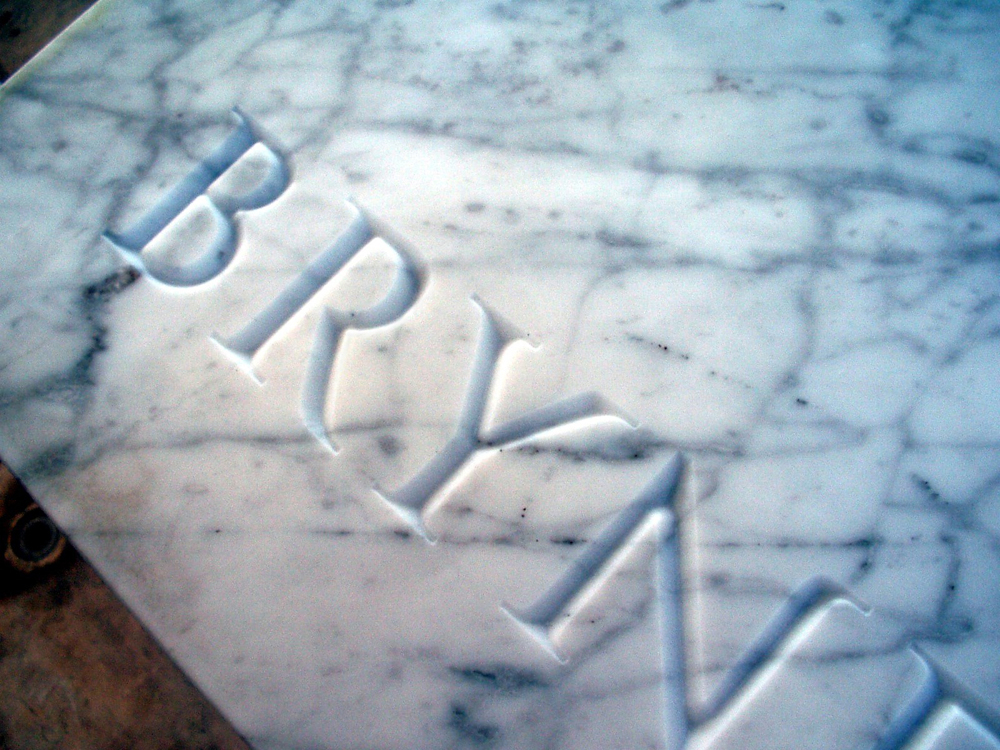
Armed Forces Memorial
A font custom designed for machine routed names into Portland stone. The number of names to be recorded was such that hand-carving was not practical. A letterform had to be devised that would be possible for a router to produce while still retaining some of the chief characteristics of handmade lettering. The height of the…
-
UK Supreme Court
This font was designed for the sole purpose of setting out a specially commissioned text by the then poet laureate Andrew Motion. While most of the letters are rather compressed in their proportions, the E has an exuberance which threads its way through the text, generating a lively texture with interesting patterns.
-
Neal’s Yard Remedies
This lettering was designed as fascia lettering for the Neal’s Yard range of shops. The studio provided a digital file which could be used to create artwork in a variety of different media, such as stainless steel lettering. The letterform harks back to older traditional typefaces, such as plantin, but with many modern features –…
-
Kew Gallery
These letters were inspired by a proposed inscription for a new gallery in Kew Gardens, London. This elegant sans serif has many subtle features which mean it is no longer a true monoline letter, but instead has a greater warmth and softness, while still retaining a certain geometrical perfection.
-
Kew Gallery Working Drawing
The basis for all font design in the studio is in drawing. It is with a pencil and a piece of paper that initial ideas are expressed and developed. It is only after this that the letters are digitised and further developed and refined.
-
R for Resurgence
This rather flamboyant and graceful letter was designed to feature in Resurgence magazine. It does, however, have sufficient strength of design to act as an independent creation, almost as a purely decorative object, and it has indeed been used in this context in the magazine and on their website.